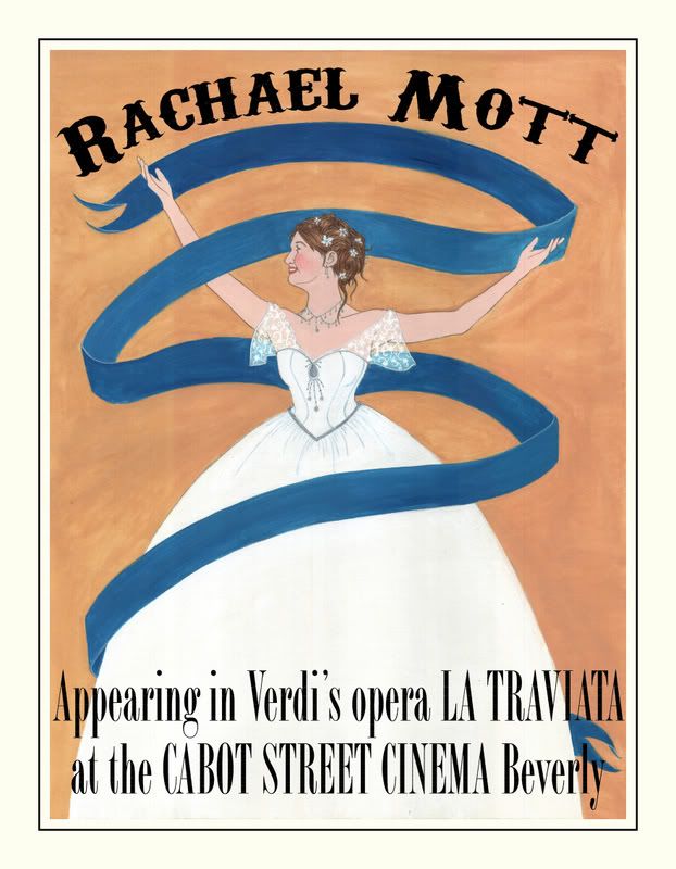
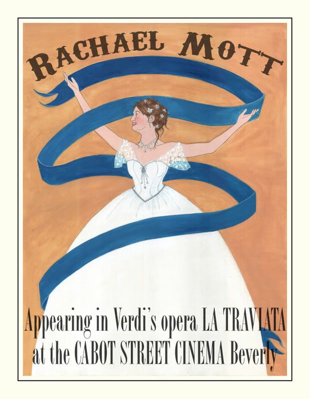
i like your color choices a lot in this piece, my only suggestion is to maybe play around with the color of the text a little bit and see what it looks like if its a maybe more dulled out black.
I agree with the text being to strong. I dropped the opacity by half--my photoshop skills are limited at best now, but I am trying--and I think that helped. Thanks for the suggestion.
Yes agreed... the color choices are nice. I do like the lighter font as well. Interesting thesis as well. I think it will suit your work nicely. And if you have any questions or anything on photoshop I'll be happy to help. I'm not an expert but I make due... graphic design is what's paying my bills until I can get that illustration career ball rolling.
I am so happy to see that you changed the black text to a rich brown, it works with the warms hues of the peice and even pops the character out more. The only thing that I would suggest trying is, since you are using the Cabot Street Cinema idea, maybe use the same text they have and add a design or some sort of background that is similar to their artwork. Other than that, beautiful job on the figure, she is stunning!
Great job! There are a lot of things working well in this illustration. I really enjoy the delicate lace work, contrasting with the large expanses of color in the background and ribbon. Also, the splashes of warmth you’ve added to the flesh tones are a nice touch. I think the font is a nice match, as well. But it’s a little busy on the bottom, however. I would consider adding more length to size of your canvass, so you can have the text in its own little space just below the bottom of the dress. And perhaps making the font a little smaller would help, too. This way you don’t have to cover over the dress, too. I am happy to work with you on this, as it can be easily achieved through photoshop. Your color choices are also working quite well. However, I would recommend adding a little more dimension to your background color -maybe adding some blue hues towards the bottom.
Blue and orange, always a good choice. one thing right away that i really wished was going on was that the text was at the same arc as the banner or vice versa. I really love the lighter text version, and i also noticed that you decided not to add the patterning to the dress, which does make me a little sad. Also, as a fellow tiny worker good job on goin big!
i think the scale is great! and the color choice is very simple, which in terms of the illustration (it isnt "busy")is a good fit. it is very delicate and i enjoy it, but i still crave some type of pattern- i dont kno how historically acurate that would be, but it would help the viewer (like me hahahaha) connect the poster to victorian times.
Vic, I love the text you chose here! but Nate is right, its pretty busy and the heirarchy seems very spread out rather than arranged in a cohesive pattern. I agree with Kyle here also about the pattern..that dress is magnificant in its scale. This volume begs for the pattern! the only other thing thats tiny for me is that the hands still feel like the same hand, but its minor. Wonderful pallette too.
hi sorry in so late. i like that your working larger,and i like small touches like the necklace and lace. i like your choice of text and color combination. i don't know if its a scanning problem but i like the background color in the photo better. i like the shape the dress is makeing, but i do miss the pattern from the sketch, i really like the expression the girl has- ya -katie


i like your color choices a lot in this piece, my only suggestion is to maybe play around with the color of the text a little bit and see what it looks like if its a maybe more dulled out black.
ReplyDeleteI agree with the text being to strong. I dropped the opacity by half--my photoshop skills are limited at best now, but I am trying--and I think that helped. Thanks for the suggestion.
ReplyDelete-Victoria
Yes agreed... the color choices are nice. I do like the lighter font as well. Interesting thesis as well. I think it will suit your work nicely. And if you have any questions or anything on photoshop I'll be happy to help. I'm not an expert but I make due... graphic design is what's paying my bills until I can get that illustration career ball rolling.
ReplyDeleteI am so happy to see that you changed the black text to a rich brown, it works with the warms hues of the peice and even pops the character out more. The only thing that I would suggest trying is, since you are using the Cabot Street Cinema idea, maybe use the same text they have and add a design or some sort of background that is similar to their artwork. Other than that, beautiful job on the figure, she is stunning!
ReplyDeleteGreat job! There are a lot of things working well in this illustration. I really enjoy the delicate lace work, contrasting with the large expanses of color in the background and ribbon. Also, the splashes of warmth you’ve added to the flesh tones are a nice touch. I think the font is a nice match, as well. But it’s a little busy on the bottom, however. I would consider adding more length to size of your canvass, so you can have the text in its own little space just below the bottom of the dress. And perhaps making the font a little smaller would help, too. This way you don’t have to cover over the dress, too. I am happy to work with you on this, as it can be easily achieved through photoshop. Your color choices are also working quite well. However, I would recommend adding a little more dimension to your background color -maybe adding some blue hues towards the bottom.
ReplyDelete3/6 studio meeting time: 1:00p
...sorry, your meeting time is 1:30p
ReplyDeleteBlue and orange, always a good choice. one thing right away that i really wished was going on was that the text was at the same arc as the banner or vice versa. I really love the lighter text version, and i also noticed that you decided not to add the patterning to the dress, which does make me a little sad. Also, as a fellow tiny worker good job on goin big!
ReplyDeletei think the scale is great! and the color choice is very simple, which in terms of the illustration (it isnt "busy")is a good fit. it is very delicate and i enjoy it, but i still crave some type of pattern- i dont kno how historically acurate that would be, but it would help the viewer (like me hahahaha) connect the poster to victorian times.
ReplyDeleteVic, I love the text you chose here! but Nate is right, its pretty busy and the heirarchy seems very spread out rather than arranged in a cohesive pattern. I agree with Kyle here also about the pattern..that dress is magnificant in its scale. This volume begs for the pattern! the only other thing thats tiny for me is that the hands still feel like the same hand, but its minor. Wonderful pallette too.
ReplyDeletehi sorry in so late. i like that your working larger,and i like small touches like the necklace and lace. i like your choice of text and color combination. i don't know if its a scanning problem but i like the background color in the photo better. i like the shape the dress is makeing, but i do miss the pattern from the sketch, i really like the expression the girl has- ya -katie
ReplyDelete